
How to Create the Right Lighting Design: Key Principles for Choosing Lighting for Each Space
Lighting design is much more than providing a space with enough light. Where light comes from, which surfaces it is directed at, how it renders colours and how people perceive it all directly shape the architectural character of a space.
That is why the right lighting design considers not only luminaire selection but also light level, colour temperature, colour rendering, light distribution, glare control and luminaire placement together.
1. Design Starts with How the Space Is Used
Every space has different lighting needs.
In an office, sufficient light on work surfaces and visual comfort come first; in a retail store, products must be seen in their true colours with a strong visual hierarchy. In museums and exhibition spaces, the effect of light on the displayed works must be considered, not just the visitor experience.
In homes, atmosphere and different usage scenarios come to the fore alongside technical requirements.
So the first question in lighting design should not be “Which luminaire should we use?” but “What should light do in this space?”
2. Not Watts, but the Light Level You Need
One of the most common approaches is to judge luminaires by their wattage. However, watts express the electrical power a luminaire consumes; on their own, they do not show the light level that will be achieved in the space.
In lighting design, luminous flux is measured in lumens (lm) and the illuminance reaching a surface in lux (lx).
Two luminaires of the same wattage can produce different amounts of light depending on the LED technology, optical system, driver, reflector and overall system efficiency.
That is why, in professional projects, products should be selected based on the required illuminance levels and photometric data, not wattage alone.
3. Colour Temperature Changes How a Space Feels
The colour temperature of light is expressed in Kelvin (K) and has a significant effect on the atmosphere of a space.
Warm tones such as 2700K create a softer, cosier atmosphere, while 3000K can strike a balance between warmth and visual clarity in architectural and decorative applications. Higher colour temperatures can create a more neutral or dynamic impression, depending on the intended use.
However, there is no single standard choice for the right colour temperature.
Wood, stone, metal, textiles and surface colours all react differently under light. So the Kelvin value should be chosen together with the architectural materials and the design concept.
4. CRI: How Accurately Does the Light Render Colours?
One of the key indicators used to assess how naturally a light source renders colours is the CRI (Color Rendering Index).
High colour rendering is especially important in retail stores, museums, galleries, hotels, restaurants and architectural projects where colour perception matters.
A light source with a high CRI helps the colours of materials, products and surfaces be perceived more accurately.
However, colour quality is not only about CRI. Criteria such as R9, colour consistency and MacAdam/SDCM are also parameters to evaluate in professional projects.
5. Beam Angle and Optics
The same luminaire can create a completely different effect with different beam angles.
Narrow-beam optics create a strong accent on a specific object or architectural detail, while wide-beam optics spread light across a larger surface.
For example, the light distribution used to highlight an artwork is not the same as the distribution needed to light the general circulation area of a store.
That is why beam angles such as 10°, 24°, 36° or 60° are not just technical values in product catalogues but important design tools.
When choosing optics, the distance between the luminaire and the target surface, the mounting height and the desired lighting effect should be considered together.
6. Glare Control and Visual Comfort
Having enough light in a space does not mean the lighting is comfortable.
Seeing the light source directly or large differences in brightness can cause uncomfortable glare.
That is why professional lighting design takes into account anti-glare optics, reflector design, cut-off angles, mounting position and criteria such as UGR.
In well-designed lighting, people usually notice the effect of light on the space before they notice the luminaire itself.
7. Choosing the Luminaire Alone Is Not Enough
A luminaire with excellent technical specifications may not deliver the desired result if it is positioned incorrectly.
Likewise, using a product with the right beam angle at the wrong mounting height can create excessive contrast, insufficient light or unwanted shadows.
That is why a successful lighting project should be approached as a whole:
luminaire + optics + placement + control + architecture
working together as one system.
Where necessary, lighting calculations and simulations should be carried out to evaluate the number and position of luminaires, the light distribution and the illuminance levels on surfaces before the project is implemented.
Conclusion: Good Lighting Should Be Felt More Than Seen
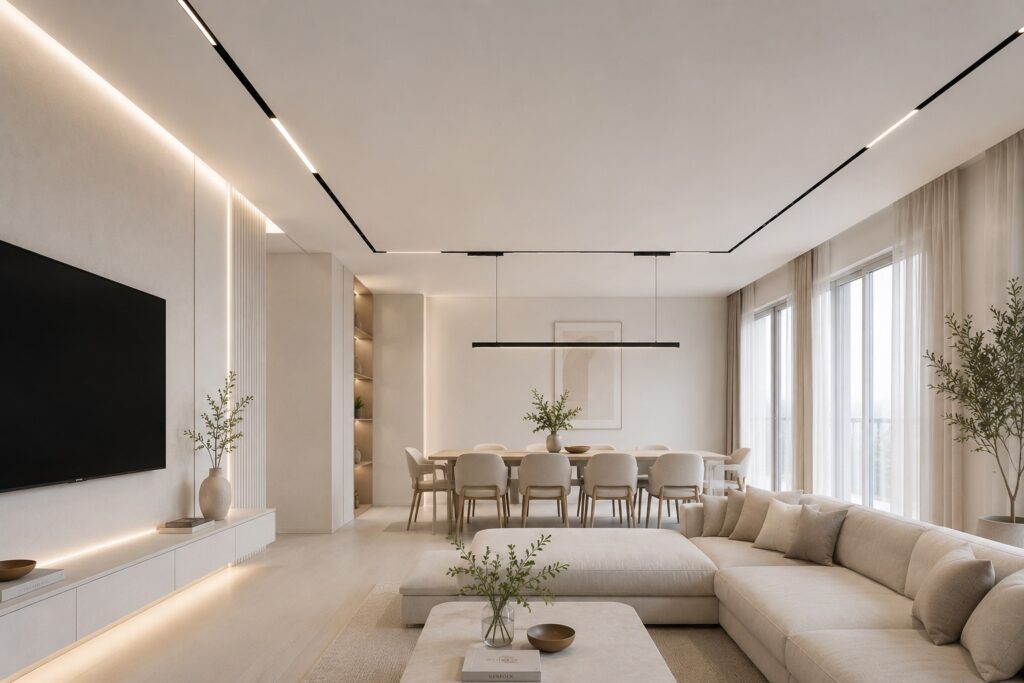
The right lighting does more than make a space visible. It defines the architecture, brings out materials, creates visual hierarchy and changes how people relate to the space.
That is why lighting should be treated as part of the architectural design process, not as a decorative or technical product group chosen at the end of the project.
Every project is different in its architecture, intended use, surfaces and user expectations. The right result comes from evaluating these variables together.
At Conflux Lighting, we see lighting not merely as product selection but as designing the relationship between light, architecture and user experience.